The E66 has an impressive specification list - slider form factor with a 2.4 inch screen, 3.2 megapixel autofocus camera, GPS, 3.5G cellular connectivity, WiFi, Bluetooth and IrDA, around 100MB of on board flash memory (plus 128MB RAM), microSD slot, FM Radio and accelerometer sensor. As you can see, in major hardware at least, it nearly measures up to Nokia's top end Nseries devices, with the most notable exception being the camera. The E66 has some extra tricks up its sleeve though, with a couple of unique features and the same customised, business-focussed version of S60 as found in the E71.
 However, at Nokia's recent Eseries launch the E71 took most of the attention and, as a result, its little sister, the E66, was left in the shade. The E71 with its compact size and QWERTY keyboard is an outstanding device and has strong appeal for power users. QWERTY keyboards are often considered a key component in an enterprise device. However this isn't really true - QWERTY equipped phones are still in the minority even amongst business users. And this is why the E66 will likely outsell the E71 by some margin.
 The launch of the E65 had a similar story, except in that case it was the E90 that was casting a long shadow. However, the E65 went on to become the best selling Eseries device - it accounts for nearly half the Eseries devices sold up to Q1 2008. Moreover, some of the E65's success was down to its ability to break out of its categorisation as an enterprise device and find success as a consumer device as well. In the UK, for example, it became a surprise best seller, as a consumer-orientated device, for operator '3' last year. This suggests that the E66 might also have the necessary attributes to become a best seller and, as such, is a device that is well worth examining in detail.
The E66 can be considered a replacement for the E65; it will have a similar launch price - around £320 (as ever, you can expect that to fall in time). The improvements in hardware and software (especially in multimedia capabilities) over the E65 are testament to how fast the mobile industry moves. Remember, it is only 18 months since the E65 reached the market. Happily for those markets which missed out last time, the E66 will see a wider distribution than its predecessor; there are three frequency variants, one for Europe, the Middle East and Asia, a second for the Americas and a third for the Latin America (Brazil) market. However it is open to debate whether either of the new Eseries devices will receive carrier support in the US market.

General Design and Hardware
At first glance the E66, at 107.5 x 49.5 x 13.6mm and 121g, appears slightly bigger than the E65 (105 x 49 x 15.5 mm, 115g), but because of its thinness it has a smaller overall volume - 62.6 cc versus 74 cc. This is all the more impressive when it is compared to a device like the N78 (76.5 cc) or the N95 8GB (90 cc). The E66 is thicker than the E71 (112 x 57 x 11 mm), but is notably narrower and, practically, this makes it a more pocketable device.

The majority of the device is in the 'bottom' section of the slide which means it feels balanced in the hand. The build quality is excellent; there is little or no leeway in the slide so it feels very stable. It is an assisted slide, which gives an extra feel of solidness and 'crispness' as you slide it into the up or down position. The slider mechanism is restricted to the middle and top of the device; this is a welcome change from the E65 where a significant portion of the keypad was lost to slider rails.

The E66 comes in two colour variants - white and black. The black version uses grey and black hard plastics on the front and sides of the device. The white version uses shiny silver plastics on the top slide portion of the front and white plastics on the keypad and side of the device. Both versions have a large metallic silver battery cover on the back, top and tailed by their respective coloured plastics. It is clear the use of materials has been very carefully considered - for example, the catches for the battery cover are a different colour and texture giving an intuitive guide for their usage.
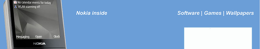
 The 2.4 inch screen sits above the main control cluster (D-pad, softkeys, send and end keys and three one touch keys), which is made up of keys which illuminate from beneath; unless the keypad lights are illuminated it is not possible to see which is which. This can be problematic outside in bright light when it is difficult to see the illumination, especially on the white variant, although most people will probably memorise the positions of the keys quickly. Usability aside, the illumination gives a stylish feel. The D-pad is excellent and the send and end keys well positioned. The delete key is directly below the D-pad, a potential problem for those with large fingers, but extremely useful for quickly working through email. The S60 key (represented by the home icon) is less accessible that on some handsets, but this is made up for by the presence of the one touch keys, which give access to the key PIM applications - messaging, calendar and contacts, a real time saver for business users. A long press on each key creates a new item in the respective application. These are the default settings and you can change these shortcuts if you like.
The numeric keypad, on the lower slide, is good, with great tactile feedback and plenty of room. Experienced T9 users should be able to achieve fast text entry rates. There is a small gap between the top of the keyboard and top part of the slide which means that the E66 avoids the cramped-top-row feeling that many slider keypads have. The keypad may be a little small for those with large hands; as ever, there is compromise between usability and size.

The left-hand-side of the device has, from bottom to top, an infrared port, microUSB port and 2.5mm audio port. The microSD card slot is just above the audio port, but is only accessible when the battery cover is removed. On the top of the device there is a distinctive red power key, which really stands out. Apparently it has been coloured red to emphasise that it is a decision making button (business users like such clarity I assume!) and to encourage its use for profile switching (one of my favourite S60 shortcuts). The right-hand-side has, from top to bottom, volume up and down keys surrounding the mute button (which acts as the voice control shortcut when no call is active) and a two stage camera capture key (focus and capture). The camera key is a significant advantage over the E71, which has to make do with the letter 't' for focussing and the central D-pad for capture. The bottom of the device houses the power port. A 3.2 megapixel camera with accompanying LED flash and mirror is found on the back of the device. The camera is housed in a slight hump which probably reflects the fact that camera modules tend to be the limiting factor in device thickness.

Compared to the E65, I welcome the move away from the proprietary Pop-port to a standard USB variant. In addition, the one touch keys now serve applications (rather than mute and conference calling), which is sensible, given their frequency of use.
The E66 has a reasonably generous BL-4U 1000 mAh battery; it should get busy users through 24 hours easily and most people will find it lasts two days. The GPS aerial is located at the top of device, in the optimum position. Along with the A-GPS functionality, it is able to achieve most locks in a handful of seconds, though environmental conditions or getting a first time lock can increase this.
 Design-wise, what stands out most about the E66 is that it has a greater feeling of style than any other Eseries device. Of course, such judgments are subjective, but the light up keys, rounded corners and choice of materials do give a sense of a more stylish device. At the E66's launch, the device’s designers mentioned that creating a sense of style had become much more of a priority for the Eseries range. Their market research, unsurprisingly, showed that people preferred a device that had a noticeable style language over those which were more utilitarian. Moreover, they said that the E65 had caught them by surprise by being very popular among women business users, who felt it matched their style better than other devices. Therefore Nokia decided to put more effort into the design of the E66 in order to continue this trend. This also explains the white versions of both the E66 and the E71; they are perceived to be more feminine, although that's a broad generalisation.
More generally, market research indicated that people felt that their phone should be representative (or an extension) of their image - think of a person placing a phone on a table in a meeting as a way of projecting personality and style. Clearly there is a personal element to style - however, for business users, this is balanced alongside other considerations, primairly a desire to project a professional business image. The designers noted that while business professionals may want a stylish device, they also want to be taken seriously and therefore have a professional looking device. The design of the E66 can therefore be seen as a marriage between these two elements.

This dual nature is echoed in another area - the split between home and business, between personal and professional. Both the Eseries designers and the marketing team explained that people want a device that could be both a business and a personal device. This is especially true for a numeric keypad-based device, where there is a less obvious business-centric distinction at first glance. While this idea is reflected partly in design language, it is also part of the reason for the inclusion of multimedia hardware capabilities such as a reasonable camera, FM Radio and 2.5mm audio jack (the E65 handled audio through its Pop-port). Although, as we shall see, it is in the software customisations that this duality gets its most obvious implementation.
Connectivity
As you would expect, the E66 has a full range of connectivity options - 3.5G (HSDPA) cellular, WiFi, infrared (included because it is popular in Asia), USB (mass storage, PC Suite and Media transfer [MTP], but sadly only USB 'Full-Speed') and Bluetooth (including support for multimedia profiles such as A2DP and AVRCP). The WLAN scanning wizard is onboard to help find and use hotspots, but it still near useless with many pay-for hotspots (I'd recommend using a third party tool, such as Devicescape). Because the E66 runs S60 3rd Edition Feature Pack 1, the access point system is still muddled and confusing for novice users and it is difficult to switch back and forth between connection types. Business devices really do need the ability to group access points together and it's a shame that Nokia hasn't done more work here.
On the bright side, the E66 comes with the full Internet telephony application so setting up standard SIP-based VoIP services is relatively easy, and very simple if the user sees a pre-configured wizard. This plays into the E66's strength as a voice centric device. In the corporate environment, it should be relatively easy to integrate the E66 into existing enterprise VoIP infrastructures.
The E66 is optimised for use as a tethered modem for the PC. There's a specific 'Connect PC to web' option when inserting a USB cable into the device. The first time you do this, it installs an application on the PC, Nokia PC Internet Access, which helps simplify the connection process. For the majority of users, this negates the need for a separate USB dongle modem, although heavy users may want to consider the implications for the E66's battery life.
S60 Software customisations
We've already seen that the E66 means the Eseries is keeping pace with other S60 devices in hardware terms, but this is only one piece of the puzzle. S60 devices aimed at business users have perhaps suffered in the past from S60's consumer focus. The PIM applications in particular are under-powered when compared to their equivalents on more enterprise-focussed platforms such as Windows Mobile or Blackberry. In common with the E71, as mentioned in our in-depth review, the E66 has a customised version of S60 and some of its applications go some way to addressing this deficit.
The first changes are to the home screen (previously known as the Idle or Standby screen), which now has the ability, via the Switch mode application, to swap between two different layouts. This allows you to effectively operate the phone in two different modes, not dissimilar to having two separate devices. It is similar to the virtual desktop idea from the PC world, but this is the first time I've seen an effective out-of-the-box implementation on a mobile device. By default, these are labeled as Business and Personal and this is the most obvious usage scenario, but you can rename and use these as you please. The switch is carried out by activating an application shortcut (the black and white icon on the far right) and takes around 5 seconds to complete.
The layout is customised using the Modes application, accessible from Settings or as an application in its own right in the Tools folder. You can customise the theme and the wallpaper in each mode, which is helpful for giving a clear visual differentiation (think of a theme with the company logo versus a personalised theme), but the real value is in customising the application shortcuts and home screen plug-ins (enabled applications). For example, with application shortcuts you might choose to show those applications which you use most in the 'business versus personal' context (e.g. File manager for business, Music player for personal). Similarly, with the home screen plug-ins you can opt to enable only those which are most relevant to the current mode; this helps the home screen from becoming too cluttered and is something I'd like to see on all S60 devices.
Perhaps the most useful tweak though is the ability to customise what is shown by the two e-mail homescreen plug-ins. You are able to specify the account and preview type (header only, header and pop-up, header and unread) which will be displayed and this means you can display different email accounts in each mode. In practice, it is a effective way to show the relevant email at the relevant time; I suspect many will use this functionality to 'switch-off' work email at the end of the day. Switch mode functionality will be welcomed with open arms by those looking to separate their home and work lives and, as far it goes, it is a good implementation. It does have its limitations and the separation is really only skin, or rather home screen, deep. At the launch, Nokia acknowledged that there was room for improvement but pointed out, quite fairly, that they had implemented the basic (and most requested) functionality first. Doing a deeper mode separation becomes increasingly difficult (e.g. do you really want completely separate calendars for example - how do know which time is free if you maintain more than one? Does anyone's life, or contact list, really split into a simple division between business and personal?).
Staying on the home screen, there's now a smart dialler - if you start typing in the name (T9 style) of a contact (first or last name) a list of matching contacts will pop up. You can then select one of these and, via a pop-up menu, choose to start a call, message or e-mail. This functionality has long been a staple of Windows Mobile (and a number of third party S60 applications) and is fairly intuitive - and a great potential time saver. Of course, if you keep typing you can still make a manual call in the usual way.
Contacts has been lightly customised. It now, via a 'right' keypress, has the same context-sensitive pop up menu as the smart dialler, allowing quick access to common contact-specific actions. In my opinion, this is more useful than 'contact groups', which were previously accessed this way and are still available via the options menu. Users coming from other platforms may still find the search function underpowered (first name, last name only), but it does now allow you to use predictive input for a search query and, of course, you can use the separate Search application for any more advanced queries.
The Calendar has undergone a bigger retrofit, most notably in the month and day views. We've summarised these changes in the next two paragraphs but they are best illustrated by the screenshots below.
The month view splits the screen in two with the upper half showing a calendar, complete with notations for days which have entries. The bottom part of the screen shows the entries for the day currently selected in the calendar shown above. If necessary, the day-listing scrolls up and down in order to show the complete list of entries. This view works very well (it is possible to use the Calendar from this screen alone) and makes very good use of screen real estate.
Week view has also been modified; rather than just being a simple grid showing current entries (and free time), it now expands the currently selected day column and shows additional information. This makes it easier to schedule entries in the context of other events. The previous Day view (a list of entries for that day, which was accessible via the month or week views) has been renamed 'agenda view' and is unchanged except that access is via the Options menu. The new Day view has an hourly layout, making it easier to see, at a glance, what your schedule looks like. Day view does require a bit of scrolling, but the advantage of having things laid out hour by hour is that it is easy to see free time slots. If you start typing some text then a new meeting will automatically be created starting at the currently selected time, just as happens in week view. You can also create new Todos, Anniversarys and Memos by pressing the D-pad in. The new event dialogs have been compacted to make better use of the available screen space; it is now possible to see (for adding and editing) all the crucial meeting information in one screen - this not only saves scrolling but makes things much clearer.
Week view
With changes to Contacts and Calendar, you might think that Messaging would also be getting an upgrade. Unfortunately this is not the case, the Messaging application is unchanged. While this is not a big an issue as on the messaging centric E71, it is a real shame given the effort that has gone into improving the Contact and Calendar applications. There are some positives - set up of basic email accounts has been greatly improved; if you use a common email service you should only have to enter your email address and password, the rest will be automatically configured for you. There remains strong support for a range of push email solutions such as Nokia Intellisync and Microsoft Exchange.
However all of this is rather let down by Messaging, with its inefficient application layout, lack of support for rich (HTML) formatted emails, relatively poor mail browsing, sorting and searching, stilted attachment handling and somewhat awkward integration of push email systems. Messaging simply looks poor next to the messaging implementations of Windows Mobile 6.1 and Blackberry. The app is not unusable by any means, but given that this is an enterprise-focussed device and email is one of most important functions after voice, the lack of changes to Messaging is very disappointing. With that said, I do expect to see a new version of Messaging in a future software update. However, I should stress that there are no guarantees and that Nokia has not made any commitments in this area (despite numerous promptings).
A more positive area is the use of the accelerometer in the E66's software. As you might expect, there is optional automatic screen rotation, but it comes with a nice extra - turn to full view. This optimises the use of screen real estate in landscape view. In Web, turning the phone into landscape will automatically trigger full screen mode, similarly in Gallery and Real Player, which in landscape mode show pictures and movies using the full screen without any accompanying UI elements. Of course you can achieve the same result yourself with a few extra steps, but it makes much more sense to have this happen automatically. Generally landscape mode works very well throughout the device - some applications (e.g. Month view in Calendar) are optimised for it, and the switch between portrait and landscape is around half a second - impressive.
And there's more - if you turn over the E66 when there is an incoming call then the ringing tone will be silenced (this also works for alarms). This works best if your phone is sitting on a table and you simply flip it over, but will also work with a similar action in the air. There is a third party piece of software that implements the same idea, Flip Silent, but this is the first time that it has been available out of the box. The final use of the accelerometer is in bringing the keypad illumination back up after it has automatically switched off. You 'nod' the phone and the keypad re-illuminates - in practice this didn't work very well for me - I found it needed more of a back-and-forth shake than a nod and it didn't always seem to work. These may be relatively simple uses of an accelerometer, but using sensors in this way is intuitive and the implementation on the E66 is a sign of things to come.

No comments:
Post a Comment