The N86 follows a well worn path; it is a device with a smartphone blood line stratching back a few years into the mists of history... The advent of the Nseries brand set Nokia on the road to the multimedia computer; devices that aimed to converge multimedia functionality and mobile phone into a single device. Its first flowering may have been in the N70, but it was with the N95 that the idea came of age. The N95 introduced the dual slide form factor and went on to become one of Nokia's most popular high end devices ever. With its integrated GPS and five megapixel camera it broke new ground - while such items may seem standard now, there was a palpable sense of amazement at the N95's launch in New York.
The N96 and N85 followed in the N95's dual sliding footsteps, but they didn't manage to capture the imagination in quite the same way. The N96 faced criticisms for being under powered (partly misconceived perception, partly reality), while the N85 didn't seem to add a great deal, aside from an AMOLED screen. Both devices had their own design issues - enough that there seems to be a popular consensus feeling that the N95 never quite got the successor it deserved. So does the N86 change that?
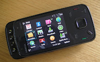
There's no simple answer here. For one, the competitive landscape has changed. Touchscreen phones have arrived by the bucket load since the introduction of the Apple iPhone. The entry of Apple and Google has shaken up the market and given the incumbents plenty to think about. However, I think its important not to get carried away and to understand the context. While touchscreen phones do get the lion's share of media and consumer attention, they are still out sold by the non-touch screen devices. Nokia has faced increased competition from RIM (Blackberry Bold and others), but, outside the enterprise space, it has continued its near total dominance of the non-touchscreen smartphone space. And, at the same time that it has faced massively increased competition at the high end, it has pushed S60 further now into the mid tier with devices like the E63, 5320, and 5800 XpressMusic.
So the N86 arrives in a different world to its predecessors; this alone means it is less likely to match the success of its illustrious predecessor. However, there are still plenty of people who have hung onto their N95 and are looking for a replacement, or those who don't want to go the touch route and are looking for a powerful consumer-focussed phone. Does the N86 deliver for them? As we'll see in this review, I think the answer is yes. The N86 is as close as you'll get to a spiritual successor to N95 and it is a really top draw consumer smartphone. There are really three main reasons for this - one, a significantly improved camera, two, a stylish and high quality design, and three, a mature* software platform that delivers an array services straight out of the box.
* Though much of the platform is mature, note that the early v10 firmware on the N86 has a few glitches - these will, in true Nokia fashion, doubtless get addressed soon in a firmware Over-The-Air update.
In the first part of this review, we're going to give you a general overview and mention some of the phone's highlights after a few days of use. We'll be examining all areas in more detail in subsequent reviews once we have had a chance to get some more real world usage under our belts, so treat this as our first impressions assessment.
Hardware
As noted in our earlier feature, the N86 8MP hardware specifications, camera aside, are not very different to the Nokia N85. The only really notable difference is the addition of a stand on the back of the device and a 21g increase in weight. If you're coming from the N95 or N96 then there are some more significant differences: the AMOLED screen, FM transmitter, RDS with the FM radio, and increased battery capacity. That said, as we'll see, the camera is a major upgrade and, just as importantly, there have been a number of tweaks to the design and materials of the phone.
As with the N85, the AMOLED screen really makes the N86 stand out if you put it next to a traditional LCD screen. AMOLED screens are becoming less unusual (e.g. i8910 HD), but it is still great to see this superior screen technology (in most, but not all, light conditions) being used. The key advantages of AMOLED are a brighter screen, increased colour range, improved contrast ratio and reduced power usage. The QVGA resolution will disappoint some, and it's a definite potential weak spot. Technical limitations means that S60 3.2 is stuck on QVGA, but that will change with the first Symbian Foundation release. On the other hand, it is also reasonable to argue that without physically increasing the size of the screen there's limited value in increasing the resolution. Smaller screens make sense on non-touchscreen devices - it's one of the prices you pay for true one handed usage.
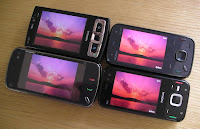
The N86, at 149g, is a heavy phone, which makes it less pocketable than a device like the N79, but it does have the benefit of giving a reassuring feel of solidity, similar to the E71, and adds to the overall impression of superior build quality. It's well weighted in the hand, in either open or closed modes. Together with the redesigned keypad, this means that it feels less bottom heavy than previous dual sliders. The slide mechanism, which is spring assisted, is excellent and feels like it will stand up to long term usage. Nokia have had plenty of experience in designing dual sliders over the years and it's one of the areas where the N86 mostly obviously benefits from its ancestry. As with the N85, the slide operates on two 'runners', which should provide good long term stability. I would rate the slide on our N86 review unit as the best so far - there is still a very small amount of movement/give, but it's much reduced from the average N95.
The N86 shares the same design language as the N97. Design is a subjective area, but I would rate the 2009 Nseries design language as a significant improvement over that of 2008 (N78, N85, N96). There's still a sense of sleekness and minimalism, especially when the slide is closed. Previous double sliders never seemed to make full use of the space below the screen - instead there was always a Nokia logo just below the screen. Thankfully this has now been moved to the top of the screen, with the control cluster making good use of the extra space and consequently feeling much less cramped. Furthermore, the control cluster now has individual physical keys for each control (rather than the flat plastic sheet seen in the softkeys, S60 key and cancel key on the N85), a particular highlight is the angled home key, much easier to hit, and arguably as visually appealing as light up keys. The multimedia key has been removed, a decision which will evoke mixed reactions, but one that does makes things less cramped. The D-pad has been enlarged and is less stiff, which makes it more comfortable to use. All of these factors add up to make a control cluster that's easier to use.
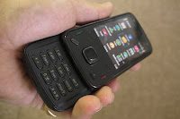
On the lower slide, a similar change sees a move away from the flat keys of the N85 and N96 to individual buttons for each number key. The buttons are reasonably spaced, have good tactile feedback and a decent amount of travel, although, as with most sliders, they're still somewhat cramped along the top row. It didn't seem to make much difference to my raw text entry speed, but the changes do improve the perception and there's less of a learning curve before you get comfortable with the keypad.
The top slide has seen as similar redesign. The individual keys are far easier to use - it's possible to use them 'blind' (e.g. when the phone is in your pocket and you want to skip a music track). Thanks to the extra illustrative icons, it's also clearer what they can be used for. The media playback functions have always been obvious, but the image zooming and N-Gage controls generally required you to read the manual before you discovered them.
On the back of the device, the camera slide follows the same design as the N85, a square block on runners. Fast and easier to use and, together with improvements to the camera software start up time, should give a better chance to capture those quick snaps. It's surrounded by a stand which lets you place the angled phone, in landscape orientation, on any flat surface. It's useful for watching videos or showing off a slide show. There's a small micro switch on the stand which, via an entry in the phone's setting, means you can specify a specific application to start when you open the stand. It defaults to Photos, but Clock might be a viable alternative.
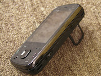
There's a key lock slider on the left of the device (slightly awkward positioning, arguably), and camera capture and volume control buttons on the right and all of them have been improved from earlier models. The microSD slot is on the lower left hand side of the device, but you need to take the back cover off to access it. Given the size of memory cards and the N86's 8GB of internal memory, it's a sensible choice, as it removes a flimsy slot cover and reduces the number of openings for dust.
The battery used is the BL-5K, rated at 1200mAh, and this should be more than enough for typical use. It's the same capacity as that in the top-rated N95 8GB but it doesn't have to power a hungry LCD screen backlight - OLED displays are much more efficient - I'd expect most N86 owners to be able to go a couple of days of normal use, at least, between charges.
There's more good news in the materials that make up the N86. The entire front of the device is covered by tempered glass and it looks fantastic. No more indented screens or dust traps here. It should also prove more scratch resistant than the plastics that have been used on other Nseries devices, although I wasn't brave enough to carry out any real tests. A hard plastic makes up the edges of the device, while the back is a single piece of plastic which is removed to access the battery and SIM card slot. Crucially, this plastic has a matt finish which makes it much more grippy and less likely to attract finger prints that the shiny plastics on the N85 and N96.
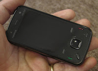
As you'll have probably guessed from the above, the overall build quality is excellent. In the Nseries line, Nokia seemed to have made gradual improvements over the years, but both the N86 and N97 are big steps forward. The build quality of both devices seemed to more closely match what you would expect from their respective price tags.
Camera (stills)
With the 8MP appended to its name it is no surprise that it is the standout feature of the N86. It is the first 8 megapixel (3280 x 2464) cameraphone that Nokia have produced. However, as we've commented in the past and as Nokia were at pains to point out at the launch in Barcelona, cameras are about a lot more than just the raw megapixel number. With the N86 there are several key factors that are more important that the increase in megapixels: increased sensor size and sensitivity, optimised Carl Zeiss optics, variable aperture and improved software algorithms. Let's work through these in turn.
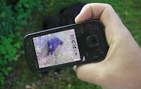
As with other a number of other Nokia devices, there's a Tessar Carl Zeiss lens in the camera, but as the first 8 MP device Nokia did suggest that extra time and attention had gone into the N86 (typically other camera modules are shared across multiple device). As a senior Carl Zeiss executive said to me at the N86's launch, 'we wouldn't put our brand on it, if we didn't think it was a good camera'. Essentially, Nokia and Carl Zeiss have worked together to provide a good an experience as possible within the physical constraints of a mobile phone and within certain cost constraints.
Nokia says the size and sensitivity of the sensor has been increased. This physical increase in the size of the sensor and improved sensitivity means that it is able to capture more incoming light (photons) over a greater area. This gives the sensor more 'information' to work with and consequently results in higher resolution and potentially higher quality pictures.
The N86 boasts a variable aperture, which means the size of the aperture (optical diameter) can be varied. The N86 has three settings: F2.4, F3.2 and F4.8, other phones typically have a fixed aperture (Nokia's are generally at F2.8). Varying the size of the aperture means the amount of light let into the sensor can be changed. Higher F numbers mean a smaller opening and, as well as letting in less light, this can give sharper images. The overall effect of this is that the N86 can produce higher quality photos over a greater range of lighting conditions. While the most noticeable difference will be in low light conditions (where camera phones typically struggle), the N86 will also take better photos in very sunny conditions (sharper). We'll put this to the test in the coming weeks.
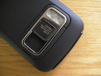
In addition to the usual Nseries mechanical shutter, Nokia have also included software that does 'automatic motion-blur reduction'. Nokia have also continued to refine their software algorithms in general and, as ever, these play an important role in the final results. Going hand in hand with this are improvements to the camera software performance; camera start up time, shutter lag and shot-to-shot times have all been improved.
Also on note in the camera department is the inclusion of a wide angle lens (28mm) lens. This means that the N86 will capture a greater area compared to a standard lens. In captured images you'll see extra material on the left, right, top and bottom of images.
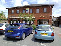
The best way to demonstrate what the camera can do is to show off a few samples:
The Camera application has the usual assembly of settings, including a customisable toolbar and geo-tagging, but the new highlight is the panorama mode. This functionality, a result of Nokia's acquisition of bitSide, automatically stiches images together to produce a wide panoramic image. A bit gimmicky? Maybe, but it does manage to produce some decent looking results:

We'll look at the rest of the Camera application and camera peformance in more detail at a future date. To kick things off, in the next few days, we'll publish a brief photo comparison, which sets the N86 against the N82, N97 and i8510, specifically testing out the crucial low light and night scenarios.
The N86 has a "Third generation dual LED flash", meaning that it's brighter than previous units, but the proof will be hopefully seen in our test photos and ongoing detailed review. Nokia continue to persevere with dual LED technology rather than Xenon for their flash units, quoting size and power efficiencies - you'll have to wait for our tests to see any illumination penalties incurred.
Video
Video capture on the original Nokia N95 was stunning for its time, taking the market leading VGA capture (at 30fps) of the niche N93 and putting it in a much more standard, mass-market form factor. The N95 8GB and N82 inherited the same camera and set up Nokia's reputation as the best video capture phones in the world. Unfortunately, the N79, N85, N96 and N97 all featured a different camera that was pre-focussed, in video mode, on infinity, making them not suitable for close-up videos of family and friends, all of whom would appear somewhat blurred.
The N86 8MP has, thankfully, a camera along the lines of the original N95's with a focus of around a metre or two. In good light, this means a depth of field that extends backwards towards the horizon and gives the best of all worlds. You can see the clarity of video from the N86 here in a test video shot in sunlight. Note also that the audio is as clear and of as high quality as we've come to expect from Nokia's Nseries.
With a gap of two years since the N95, you might have expected Nokia to have progressed beyond VGA capture, but this is something of a technological sweet spot. If you increase resolution further you start increasing the file sizes of movies way beyond the current 20MB/min, requiring more and more storage to save files and requiring more and more processor power to encode and manage them. As we've seen with the Samsung i8910 HD, it's easy to mess up in this area (frame rate drops, audio problems), but I would expect to see Nokia announce a phone with 720p (HD) recording at some point, possibly MWC next year, when the electronics, processor power and storage equations have all been solved.
In summary, video capture is as good as, or possibly a bit better than, that from the N95 and N93 - there are certainly no focus issues as we've seen (disappointingly) even in the recent N97.
Software
The N86 runs S60 3rd Edition Feature Pack 2 on Symbian OS 9.3. This is now a mature platform and a known quantity. For some this will mean the UI feels a little dated and unexciting compared to S60 5th Edition or other touch UIs, but for others this familiarity will be welcome. S60 3rd Edition increasingly seems to face criticism for being out-dated or slow. That really isn't fair, as the N86's overall performance is very good and, while it may lack the glam and glitter of recent touch interface devices, it often gets the job done faster. The core functions remain accessible for new users and, for the moment, its phone centric approach addresses a broader market than the tablet/Internet-centric approaches typical of touch screens UIs. It's no accident that it remains the dominant UI on non-touchscreen open mobile platform devices.
If you're moving up from Feature Pack 1 (e.g. N95) you'll notice a very definite performance boost both in overall speed and battery life time (in addition to the savings from having an OLED display). The addition of the central softkey, easier multi-tasking and other usability tweaks all make life easier in day to day usage; while technologies such as firmware-over-the-air updates and improved support for multimedia and Internet standards add significant functionality.
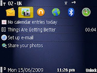
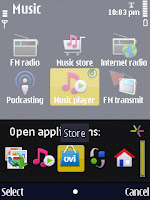
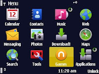
The standard S60 software applications, such as Contacts, Calendar, Messaging and the 'Office' software suite are all present. As an Nseries device, the N86 also has a number of extras, including UPnP support (via the Home network application) and Internet radio. The N86 makes full use of the new standard Nokia iconography set, which does its job in providing functionality clues and consistency, such that you hardly notice it (as it should be).
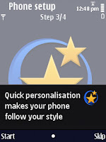
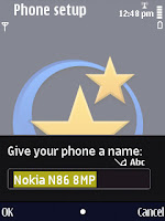
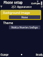
A nice touch is the updated welcome application that helps you set up your phone. As before, it links into the Settings wizard (set up operator settings and email) and Switch (copy contacts and other content from another phone) applications, but it now also includes a few extra stages. These include the ability to set the phone's name (for Bluetooth), customise ringtones, and set wallpaper and themes. Not only does it allow an extra degree of customisation from the outset, it also introduces users to fact they can customise their phone.
Nokia's development of Ovi software and services continues apace and the N86 gets the full treatment. Ovi Maps, N-Gage, Nokia Messaging, Music Store are all pre-installed and offer a consistent and rich level of service experience that competing manufacturers will find difficult to match. There are still plenty of holes (music DRM, application usability concerns, operator intransigence, user education, resource-heavy PC software, incomplete single sign on, and so on), but Nokia's vision of an extra service layer is starting to come into focus.
The most recently launched service, Ovi Store, is not pre-installed in v10 on our review device, but is likely to be added in later firmware and should be available via Download! or direct from the store.ovi.mobi site. Nor are other Ovi services, such as Sync, well promoted, but that's probably a good thing as they need to go through another development iteration.
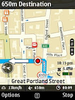
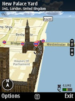
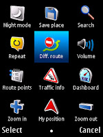
Ovi Maps 3.0 (previously Nokia Maps) is installed out of the box (the first phone thus equipped). As we mentioned late last last week, Ovi Maps 3.0 is a big step forward from Nokia Maps 2.0. There's still room for improvement, but I think it's comfortably past the 'good enough' point and well on the way to 'very usable' territory. The sync to the web version of the Ovi Maps is a particular highlight, even if it's not immediately obvious. Generously, Nokia include a six month drive license (Europe) and a lifetime pedestrian navigation license (worldwide), which has a total value of about £35. Once the drive license has expired, you'll have to pay to renew the license, but, as with earlier versions, non-navigation functionality remains fully operational.
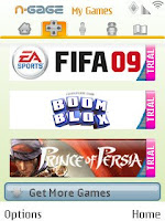
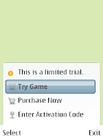
The N86 also features the N-Gage games service out of the box. The central two keys, on the top multimedia slide, act as 'a' and 'b' buttons in games when the phone is held in landscape mode. Around 15 trial N-Gage games are installed by default (into the 8GB of internal memory) and an activation code, redeemable against any game, with a value of £8, is included in the box.
Also pre-installed is Nokia Messaging, which significantly improves the email software compared to earlier S60 devices. Email is now also much easier to set up, a shortcut is provided off the home screen and, in most cases, you should only need to supply your email address and password, the rest will be done for you.
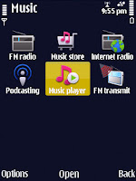
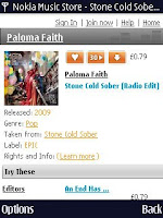
The standard S60 Music player is present, which has evolved into a usable, if unexciting, application since the days of the N95. The Nokia Music store is easily accessible and well integrated with the phone's music library. Purchased music comes in WMA format with DRM protection, but it looks likely that by the end of year this will have been switched to DRM free MP3 files.
Around 10 tracks are pre-installed (varies by market), which is a nice touch as it lets you play around with the Music player before syncing your own music or purchasing from the Music store. The integrated FM transmitter gives an alternative (and more universal) option for playback, in addition to Bluetooth A2DP. With Podcasting, FM radio and Internet radio applications, the audio software suite remains comprehensive and a definite highlight. There's nothing revolutionary going on, but as soon as you switch on the device for the first time it is ready to go.

We'll cover specific parts of the phone's software in more detail at a later date, but as noted above it's very much a known quantity. You can read the relevant sections of our other recent hardware reviews to get further insight.
Conclusion
At £400 (initial launch price, SIM-free), the N86 falls firmly into the 'expensive' category. Against devices like the N82 or N95 8GB, which are approaching the end of their lives (and have price cuts to match), it may look even more expensive. However, both of these devices were more expensive than the N86 when they first launched. In terms of top end Nseries devices, the N86 is, comparatively, one of the best value.
The big issue for the Nokia N86 is that it faces the prospect of launching in the shadows of this summer's big touch screen heros - the Apple iPhone 3GS, Nokia N97, HTC Magic, Samsing i8910 HD, and HTC Touch Diamond 2. However, while the hype may be elsewhere, the fact remains that the N86 is a very impressive, even desirable device. As the latest evolution in Nokia's dual slider form factor (and as a true multimedia powerhouse) it has something of a 'classic' feel, but it also benefits greatly from the maturity of a device with ancestry.
At one level, it all comes down to whether you want a touch device or not... However, that's not an easy question to answer. It may be tempting to go with the new technology just for the sake of it, but you may then find yourself wishing you had stayed with non touch devices.
If you're looking for a consumer-focussed, non-touchscreen smartphone, then I think the N86 is a very strong contender and is, arguably, the best device that money can buy.
The N96 and N85 followed in the N95's dual sliding footsteps, but they didn't manage to capture the imagination in quite the same way. The N96 faced criticisms for being under powered (partly misconceived perception, partly reality), while the N85 didn't seem to add a great deal, aside from an AMOLED screen. Both devices had their own design issues - enough that there seems to be a popular consensus feeling that the N95 never quite got the successor it deserved. So does the N86 change that?

There's no simple answer here. For one, the competitive landscape has changed. Touchscreen phones have arrived by the bucket load since the introduction of the Apple iPhone. The entry of Apple and Google has shaken up the market and given the incumbents plenty to think about. However, I think its important not to get carried away and to understand the context. While touchscreen phones do get the lion's share of media and consumer attention, they are still out sold by the non-touch screen devices. Nokia has faced increased competition from RIM (Blackberry Bold and others), but, outside the enterprise space, it has continued its near total dominance of the non-touchscreen smartphone space. And, at the same time that it has faced massively increased competition at the high end, it has pushed S60 further now into the mid tier with devices like the E63, 5320, and 5800 XpressMusic.
So the N86 arrives in a different world to its predecessors; this alone means it is less likely to match the success of its illustrious predecessor. However, there are still plenty of people who have hung onto their N95 and are looking for a replacement, or those who don't want to go the touch route and are looking for a powerful consumer-focussed phone. Does the N86 deliver for them? As we'll see in this review, I think the answer is yes. The N86 is as close as you'll get to a spiritual successor to N95 and it is a really top draw consumer smartphone. There are really three main reasons for this - one, a significantly improved camera, two, a stylish and high quality design, and three, a mature* software platform that delivers an array services straight out of the box.
* Though much of the platform is mature, note that the early v10 firmware on the N86 has a few glitches - these will, in true Nokia fashion, doubtless get addressed soon in a firmware Over-The-Air update.
In the first part of this review, we're going to give you a general overview and mention some of the phone's highlights after a few days of use. We'll be examining all areas in more detail in subsequent reviews once we have had a chance to get some more real world usage under our belts, so treat this as our first impressions assessment.
Hardware
As noted in our earlier feature, the N86 8MP hardware specifications, camera aside, are not very different to the Nokia N85. The only really notable difference is the addition of a stand on the back of the device and a 21g increase in weight. If you're coming from the N95 or N96 then there are some more significant differences: the AMOLED screen, FM transmitter, RDS with the FM radio, and increased battery capacity. That said, as we'll see, the camera is a major upgrade and, just as importantly, there have been a number of tweaks to the design and materials of the phone.
As with the N85, the AMOLED screen really makes the N86 stand out if you put it next to a traditional LCD screen. AMOLED screens are becoming less unusual (e.g. i8910 HD), but it is still great to see this superior screen technology (in most, but not all, light conditions) being used. The key advantages of AMOLED are a brighter screen, increased colour range, improved contrast ratio and reduced power usage. The QVGA resolution will disappoint some, and it's a definite potential weak spot. Technical limitations means that S60 3.2 is stuck on QVGA, but that will change with the first Symbian Foundation release. On the other hand, it is also reasonable to argue that without physically increasing the size of the screen there's limited value in increasing the resolution. Smaller screens make sense on non-touchscreen devices - it's one of the prices you pay for true one handed usage.

The N86, at 149g, is a heavy phone, which makes it less pocketable than a device like the N79, but it does have the benefit of giving a reassuring feel of solidity, similar to the E71, and adds to the overall impression of superior build quality. It's well weighted in the hand, in either open or closed modes. Together with the redesigned keypad, this means that it feels less bottom heavy than previous dual sliders. The slide mechanism, which is spring assisted, is excellent and feels like it will stand up to long term usage. Nokia have had plenty of experience in designing dual sliders over the years and it's one of the areas where the N86 mostly obviously benefits from its ancestry. As with the N85, the slide operates on two 'runners', which should provide good long term stability. I would rate the slide on our N86 review unit as the best so far - there is still a very small amount of movement/give, but it's much reduced from the average N95.
The N86 shares the same design language as the N97. Design is a subjective area, but I would rate the 2009 Nseries design language as a significant improvement over that of 2008 (N78, N85, N96). There's still a sense of sleekness and minimalism, especially when the slide is closed. Previous double sliders never seemed to make full use of the space below the screen - instead there was always a Nokia logo just below the screen. Thankfully this has now been moved to the top of the screen, with the control cluster making good use of the extra space and consequently feeling much less cramped. Furthermore, the control cluster now has individual physical keys for each control (rather than the flat plastic sheet seen in the softkeys, S60 key and cancel key on the N85), a particular highlight is the angled home key, much easier to hit, and arguably as visually appealing as light up keys. The multimedia key has been removed, a decision which will evoke mixed reactions, but one that does makes things less cramped. The D-pad has been enlarged and is less stiff, which makes it more comfortable to use. All of these factors add up to make a control cluster that's easier to use.

On the lower slide, a similar change sees a move away from the flat keys of the N85 and N96 to individual buttons for each number key. The buttons are reasonably spaced, have good tactile feedback and a decent amount of travel, although, as with most sliders, they're still somewhat cramped along the top row. It didn't seem to make much difference to my raw text entry speed, but the changes do improve the perception and there's less of a learning curve before you get comfortable with the keypad.
The top slide has seen as similar redesign. The individual keys are far easier to use - it's possible to use them 'blind' (e.g. when the phone is in your pocket and you want to skip a music track). Thanks to the extra illustrative icons, it's also clearer what they can be used for. The media playback functions have always been obvious, but the image zooming and N-Gage controls generally required you to read the manual before you discovered them.
On the back of the device, the camera slide follows the same design as the N85, a square block on runners. Fast and easier to use and, together with improvements to the camera software start up time, should give a better chance to capture those quick snaps. It's surrounded by a stand which lets you place the angled phone, in landscape orientation, on any flat surface. It's useful for watching videos or showing off a slide show. There's a small micro switch on the stand which, via an entry in the phone's setting, means you can specify a specific application to start when you open the stand. It defaults to Photos, but Clock might be a viable alternative.

There's a key lock slider on the left of the device (slightly awkward positioning, arguably), and camera capture and volume control buttons on the right and all of them have been improved from earlier models. The microSD slot is on the lower left hand side of the device, but you need to take the back cover off to access it. Given the size of memory cards and the N86's 8GB of internal memory, it's a sensible choice, as it removes a flimsy slot cover and reduces the number of openings for dust.
The battery used is the BL-5K, rated at 1200mAh, and this should be more than enough for typical use. It's the same capacity as that in the top-rated N95 8GB but it doesn't have to power a hungry LCD screen backlight - OLED displays are much more efficient - I'd expect most N86 owners to be able to go a couple of days of normal use, at least, between charges.
There's more good news in the materials that make up the N86. The entire front of the device is covered by tempered glass and it looks fantastic. No more indented screens or dust traps here. It should also prove more scratch resistant than the plastics that have been used on other Nseries devices, although I wasn't brave enough to carry out any real tests. A hard plastic makes up the edges of the device, while the back is a single piece of plastic which is removed to access the battery and SIM card slot. Crucially, this plastic has a matt finish which makes it much more grippy and less likely to attract finger prints that the shiny plastics on the N85 and N96.

As you'll have probably guessed from the above, the overall build quality is excellent. In the Nseries line, Nokia seemed to have made gradual improvements over the years, but both the N86 and N97 are big steps forward. The build quality of both devices seemed to more closely match what you would expect from their respective price tags.
Camera (stills)
With the 8MP appended to its name it is no surprise that it is the standout feature of the N86. It is the first 8 megapixel (3280 x 2464) cameraphone that Nokia have produced. However, as we've commented in the past and as Nokia were at pains to point out at the launch in Barcelona, cameras are about a lot more than just the raw megapixel number. With the N86 there are several key factors that are more important that the increase in megapixels: increased sensor size and sensitivity, optimised Carl Zeiss optics, variable aperture and improved software algorithms. Let's work through these in turn.

As with other a number of other Nokia devices, there's a Tessar Carl Zeiss lens in the camera, but as the first 8 MP device Nokia did suggest that extra time and attention had gone into the N86 (typically other camera modules are shared across multiple device). As a senior Carl Zeiss executive said to me at the N86's launch, 'we wouldn't put our brand on it, if we didn't think it was a good camera'. Essentially, Nokia and Carl Zeiss have worked together to provide a good an experience as possible within the physical constraints of a mobile phone and within certain cost constraints.
Nokia says the size and sensitivity of the sensor has been increased. This physical increase in the size of the sensor and improved sensitivity means that it is able to capture more incoming light (photons) over a greater area. This gives the sensor more 'information' to work with and consequently results in higher resolution and potentially higher quality pictures.
The N86 boasts a variable aperture, which means the size of the aperture (optical diameter) can be varied. The N86 has three settings: F2.4, F3.2 and F4.8, other phones typically have a fixed aperture (Nokia's are generally at F2.8). Varying the size of the aperture means the amount of light let into the sensor can be changed. Higher F numbers mean a smaller opening and, as well as letting in less light, this can give sharper images. The overall effect of this is that the N86 can produce higher quality photos over a greater range of lighting conditions. While the most noticeable difference will be in low light conditions (where camera phones typically struggle), the N86 will also take better photos in very sunny conditions (sharper). We'll put this to the test in the coming weeks.

In addition to the usual Nseries mechanical shutter, Nokia have also included software that does 'automatic motion-blur reduction'. Nokia have also continued to refine their software algorithms in general and, as ever, these play an important role in the final results. Going hand in hand with this are improvements to the camera software performance; camera start up time, shutter lag and shot-to-shot times have all been improved.
Also on note in the camera department is the inclusion of a wide angle lens (28mm) lens. This means that the N86 will capture a greater area compared to a standard lens. In captured images you'll see extra material on the left, right, top and bottom of images.
The best way to demonstrate what the camera can do is to show off a few samples:

The Camera application has the usual assembly of settings, including a customisable toolbar and geo-tagging, but the new highlight is the panorama mode. This functionality, a result of Nokia's acquisition of bitSide, automatically stiches images together to produce a wide panoramic image. A bit gimmicky? Maybe, but it does manage to produce some decent looking results:

We'll look at the rest of the Camera application and camera peformance in more detail at a future date. To kick things off, in the next few days, we'll publish a brief photo comparison, which sets the N86 against the N82, N97 and i8510, specifically testing out the crucial low light and night scenarios.
The N86 has a "Third generation dual LED flash", meaning that it's brighter than previous units, but the proof will be hopefully seen in our test photos and ongoing detailed review. Nokia continue to persevere with dual LED technology rather than Xenon for their flash units, quoting size and power efficiencies - you'll have to wait for our tests to see any illumination penalties incurred.
Video
Video capture on the original Nokia N95 was stunning for its time, taking the market leading VGA capture (at 30fps) of the niche N93 and putting it in a much more standard, mass-market form factor. The N95 8GB and N82 inherited the same camera and set up Nokia's reputation as the best video capture phones in the world. Unfortunately, the N79, N85, N96 and N97 all featured a different camera that was pre-focussed, in video mode, on infinity, making them not suitable for close-up videos of family and friends, all of whom would appear somewhat blurred.
The N86 8MP has, thankfully, a camera along the lines of the original N95's with a focus of around a metre or two. In good light, this means a depth of field that extends backwards towards the horizon and gives the best of all worlds. You can see the clarity of video from the N86 here in a test video shot in sunlight. Note also that the audio is as clear and of as high quality as we've come to expect from Nokia's Nseries.
With a gap of two years since the N95, you might have expected Nokia to have progressed beyond VGA capture, but this is something of a technological sweet spot. If you increase resolution further you start increasing the file sizes of movies way beyond the current 20MB/min, requiring more and more storage to save files and requiring more and more processor power to encode and manage them. As we've seen with the Samsung i8910 HD, it's easy to mess up in this area (frame rate drops, audio problems), but I would expect to see Nokia announce a phone with 720p (HD) recording at some point, possibly MWC next year, when the electronics, processor power and storage equations have all been solved.
In summary, video capture is as good as, or possibly a bit better than, that from the N95 and N93 - there are certainly no focus issues as we've seen (disappointingly) even in the recent N97.
Software
The N86 runs S60 3rd Edition Feature Pack 2 on Symbian OS 9.3. This is now a mature platform and a known quantity. For some this will mean the UI feels a little dated and unexciting compared to S60 5th Edition or other touch UIs, but for others this familiarity will be welcome. S60 3rd Edition increasingly seems to face criticism for being out-dated or slow. That really isn't fair, as the N86's overall performance is very good and, while it may lack the glam and glitter of recent touch interface devices, it often gets the job done faster. The core functions remain accessible for new users and, for the moment, its phone centric approach addresses a broader market than the tablet/Internet-centric approaches typical of touch screens UIs. It's no accident that it remains the dominant UI on non-touchscreen open mobile platform devices.
If you're moving up from Feature Pack 1 (e.g. N95) you'll notice a very definite performance boost both in overall speed and battery life time (in addition to the savings from having an OLED display). The addition of the central softkey, easier multi-tasking and other usability tweaks all make life easier in day to day usage; while technologies such as firmware-over-the-air updates and improved support for multimedia and Internet standards add significant functionality.


The standard S60 software applications, such as Contacts, Calendar, Messaging and the 'Office' software suite are all present. As an Nseries device, the N86 also has a number of extras, including UPnP support (via the Home network application) and Internet radio. The N86 makes full use of the new standard Nokia iconography set, which does its job in providing functionality clues and consistency, such that you hardly notice it (as it should be).
A nice touch is the updated welcome application that helps you set up your phone. As before, it links into the Settings wizard (set up operator settings and email) and Switch (copy contacts and other content from another phone) applications, but it now also includes a few extra stages. These include the ability to set the phone's name (for Bluetooth), customise ringtones, and set wallpaper and themes. Not only does it allow an extra degree of customisation from the outset, it also introduces users to fact they can customise their phone.


Nokia's development of Ovi software and services continues apace and the N86 gets the full treatment. Ovi Maps, N-Gage, Nokia Messaging, Music Store are all pre-installed and offer a consistent and rich level of service experience that competing manufacturers will find difficult to match. There are still plenty of holes (music DRM, application usability concerns, operator intransigence, user education, resource-heavy PC software, incomplete single sign on, and so on), but Nokia's vision of an extra service layer is starting to come into focus.
The most recently launched service, Ovi Store, is not pre-installed in v10 on our review device, but is likely to be added in later firmware and should be available via Download! or direct from the store.ovi.mobi site. Nor are other Ovi services, such as Sync, well promoted, but that's probably a good thing as they need to go through another development iteration.
Ovi Maps 3.0 (previously Nokia Maps) is installed out of the box (the first phone thus equipped). As we mentioned late last last week, Ovi Maps 3.0 is a big step forward from Nokia Maps 2.0. There's still room for improvement, but I think it's comfortably past the 'good enough' point and well on the way to 'very usable' territory. The sync to the web version of the Ovi Maps is a particular highlight, even if it's not immediately obvious. Generously, Nokia include a six month drive license (Europe) and a lifetime pedestrian navigation license (worldwide), which has a total value of about £35. Once the drive license has expired, you'll have to pay to renew the license, but, as with earlier versions, non-navigation functionality remains fully operational.


The N86 also features the N-Gage games service out of the box. The central two keys, on the top multimedia slide, act as 'a' and 'b' buttons in games when the phone is held in landscape mode. Around 15 trial N-Gage games are installed by default (into the 8GB of internal memory) and an activation code, redeemable against any game, with a value of £8, is included in the box.


Also pre-installed is Nokia Messaging, which significantly improves the email software compared to earlier S60 devices. Email is now also much easier to set up, a shortcut is provided off the home screen and, in most cases, you should only need to supply your email address and password, the rest will be done for you.
The standard S60 Music player is present, which has evolved into a usable, if unexciting, application since the days of the N95. The Nokia Music store is easily accessible and well integrated with the phone's music library. Purchased music comes in WMA format with DRM protection, but it looks likely that by the end of year this will have been switched to DRM free MP3 files.
Around 10 tracks are pre-installed (varies by market), which is a nice touch as it lets you play around with the Music player before syncing your own music or purchasing from the Music store. The integrated FM transmitter gives an alternative (and more universal) option for playback, in addition to Bluetooth A2DP. With Podcasting, FM radio and Internet radio applications, the audio software suite remains comprehensive and a definite highlight. There's nothing revolutionary going on, but as soon as you switch on the device for the first time it is ready to go.


We'll cover specific parts of the phone's software in more detail at a later date, but as noted above it's very much a known quantity. You can read the relevant sections of our other recent hardware reviews to get further insight.
Conclusion
At £400 (initial launch price, SIM-free), the N86 falls firmly into the 'expensive' category. Against devices like the N82 or N95 8GB, which are approaching the end of their lives (and have price cuts to match), it may look even more expensive. However, both of these devices were more expensive than the N86 when they first launched. In terms of top end Nseries devices, the N86 is, comparatively, one of the best value.
The big issue for the Nokia N86 is that it faces the prospect of launching in the shadows of this summer's big touch screen heros - the Apple iPhone 3GS, Nokia N97, HTC Magic, Samsing i8910 HD, and HTC Touch Diamond 2. However, while the hype may be elsewhere, the fact remains that the N86 is a very impressive, even desirable device. As the latest evolution in Nokia's dual slider form factor (and as a true multimedia powerhouse) it has something of a 'classic' feel, but it also benefits greatly from the maturity of a device with ancestry.
At one level, it all comes down to whether you want a touch device or not... However, that's not an easy question to answer. It may be tempting to go with the new technology just for the sake of it, but you may then find yourself wishing you had stayed with non touch devices.
If you're looking for a consumer-focussed, non-touchscreen smartphone, then I think the N86 is a very strong contender and is, arguably, the best device that money can buy.


No comments:
Post a Comment